The first image I have posted is of fruit that was drawn for my Drawing II class, 2008. It was an assignment of which we had to take a close up photograph of a fruit of our choice. This piece was drawn on light blue charcoal paper that is also a complimentary color to the dominant orange. I used soft pastels and I focused most of my attention on the detail of the oranges being that it is the most dominant of the piece.

The second image was also made in my Drawing II class. The assignment was to take a single bag and photograph it, modify the photos by making them opaque and then overlapping. I drew from the Photoshop image using compressed charcoal on rough charcoal paper and shading with my fingers. As far as getting the lines to appear sharp I used a small eraser to keep the appearance crisp and neat.

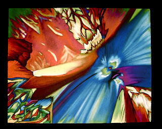
After finding a microscopic image online, in this case it happens to be beer, I created the inspiration for my third piece. The idea the assignment from Drawing II was to basically replicate the found image using pastel on black charcoal paper. For the most part the piece looks like the original photograph. I modified the original found image in Adobe Photoshop by combining it with another microscopic image only to make it slightly more interesting and make it more my own.


3 comments:
wow thats really dope i had no idea you were so artistic. the mosaic and the opaque paper were just too fresh
Brie your fruit looks amazing. I like that it's on blue paper too.
This comment is for the paper bag drawing, I believe the strongest part of this drawing is your ability to create the transitions of each fold of the bag. This produces a realist look that announces there is light and you can see its shadows, folds, bends and texture.
Post a Comment